How to Read Tables, Charts and Graphs:
Line, Pie, Bar, Pictorgraphs and How They Inform and Mislead.
Line Graphs/Tables:
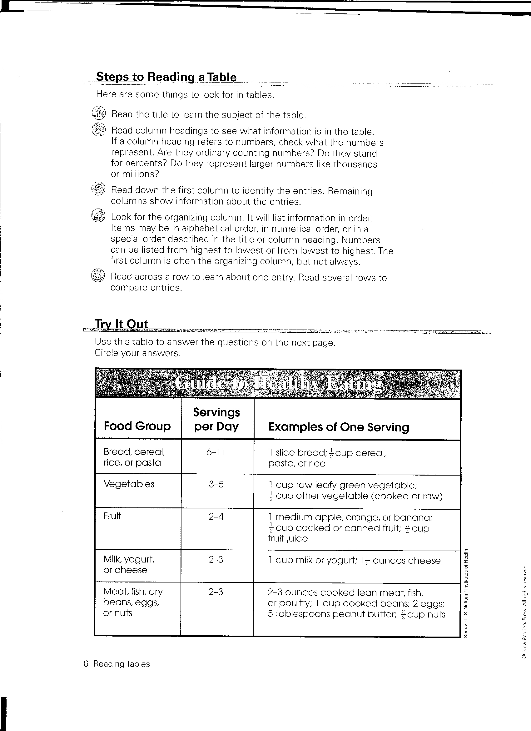
steps_to_readingtable_p1.jpg File Size: 881 kb File Type: jpg
Download File
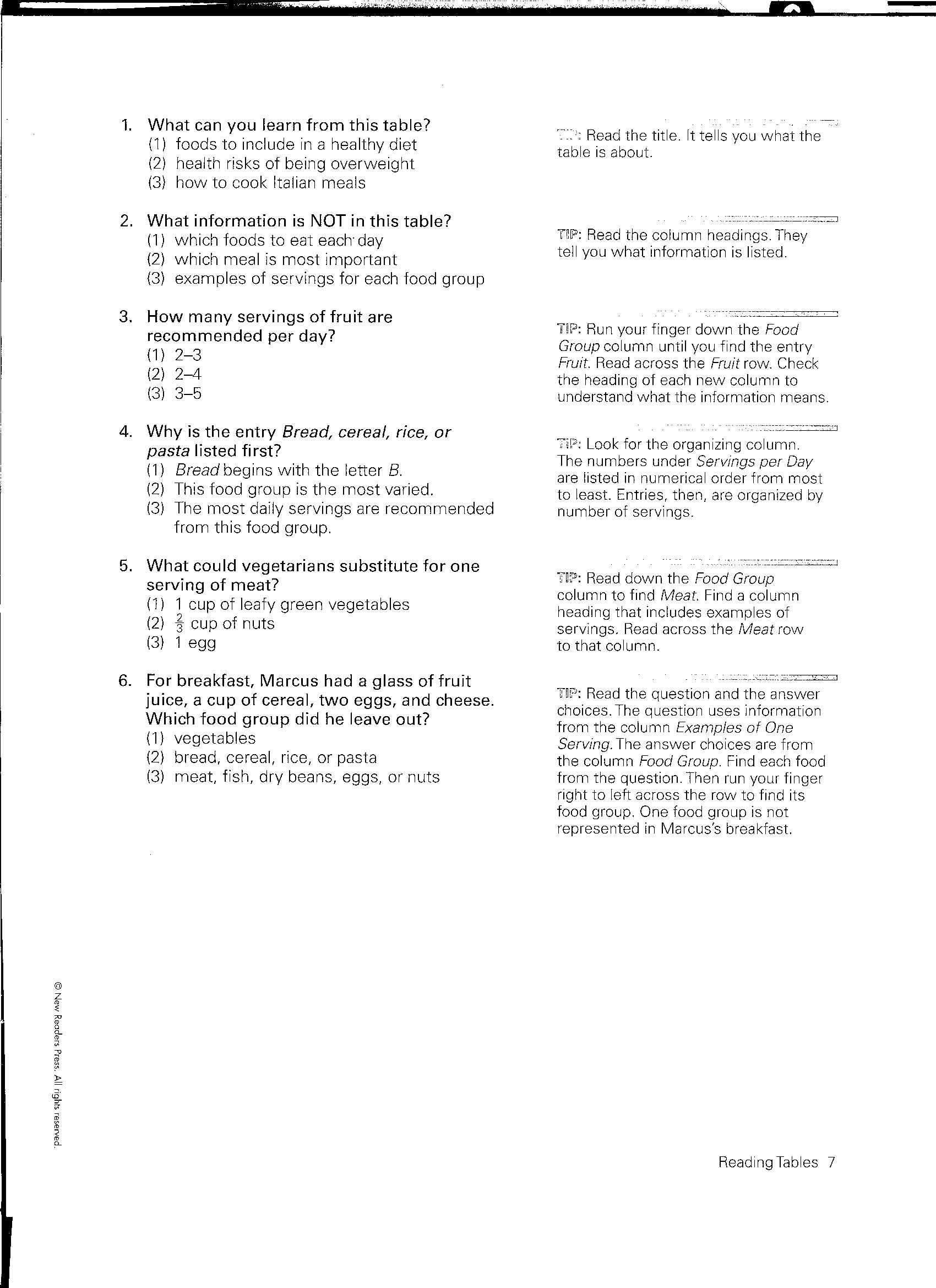
steps_to_reading_a_table_p2.jpg File Size: 732 kb File Type: jpg
Download File
Examples of Charts and Tables:
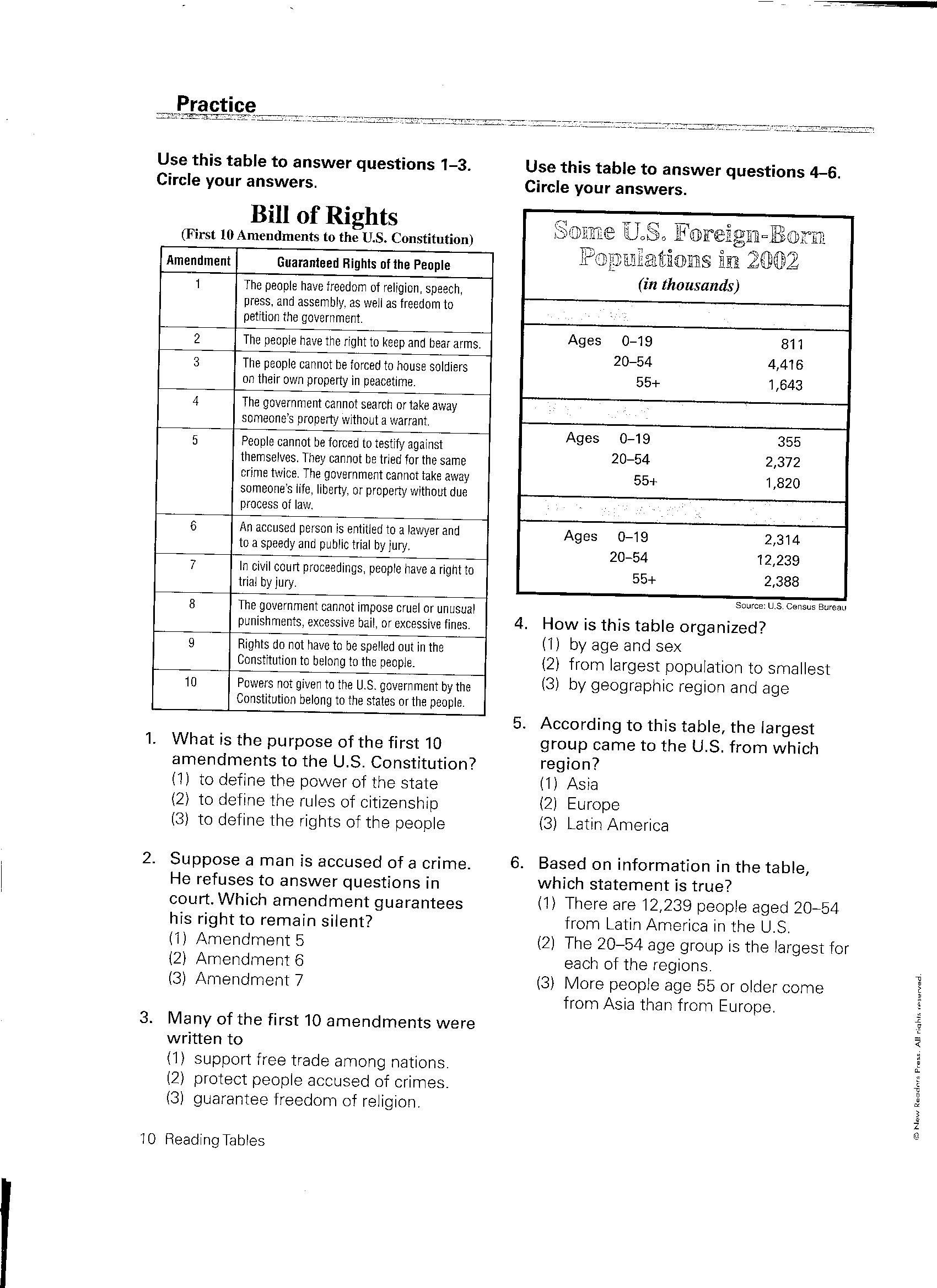
bill_of_rights_table.jpg File Size: 922 kb File Type: jpg
Download File
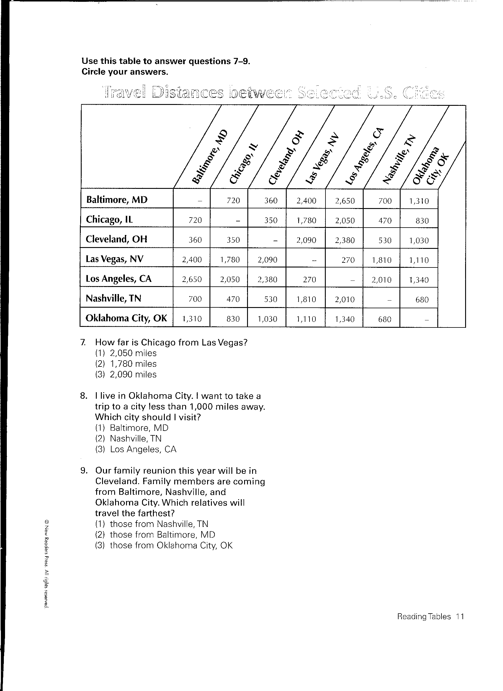
travel_distance_table.jpg File Size: 619 kb File Type: jpg
Download File
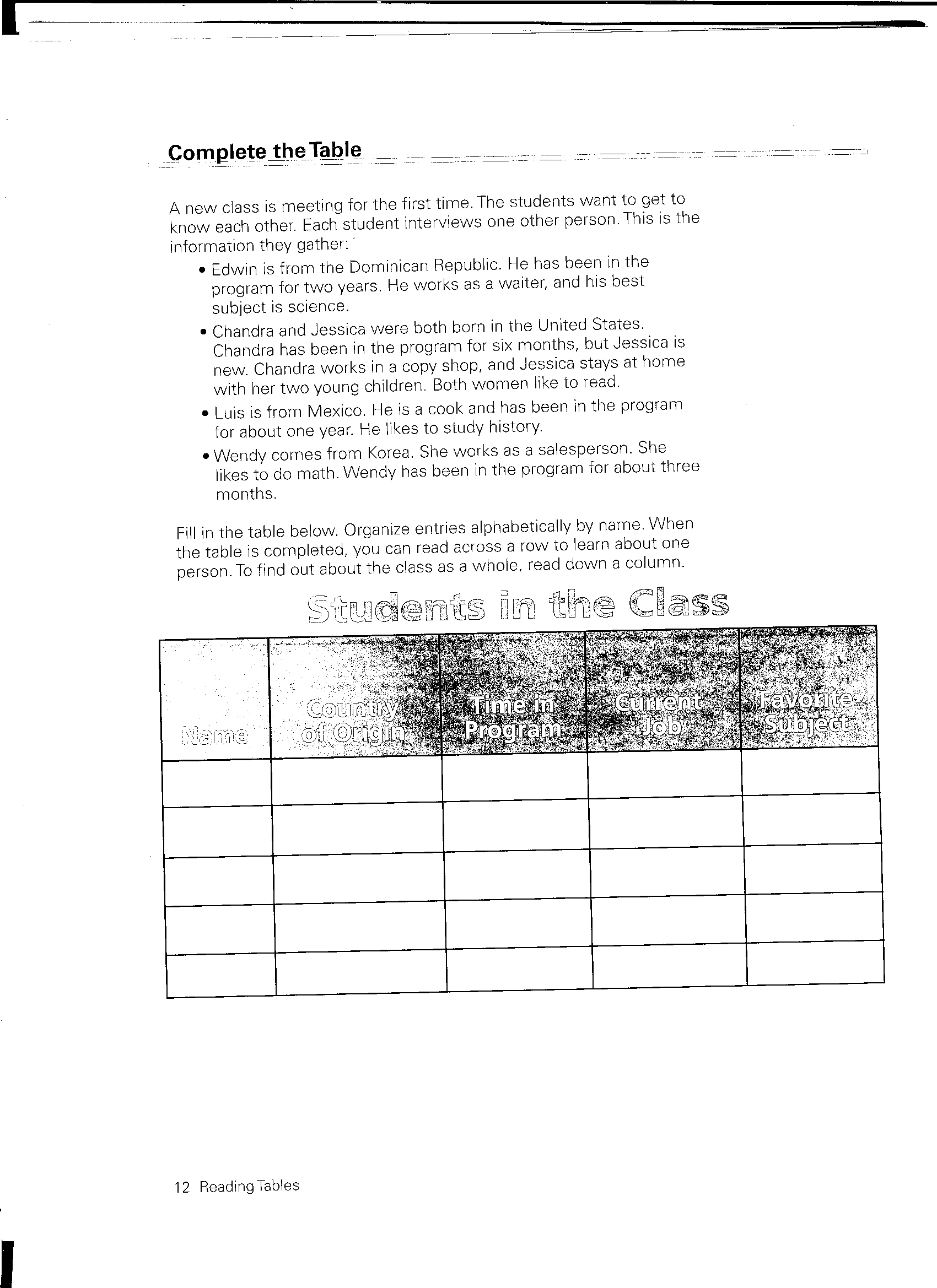
students_in_a_class_table.jpg File Size: 856 kb File Type: jpg
Download File
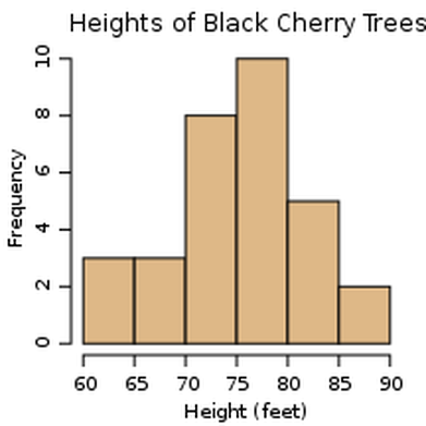
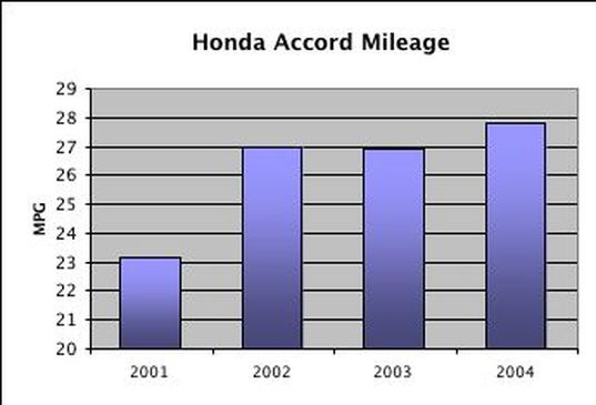
Examples of Graphs and Charts:
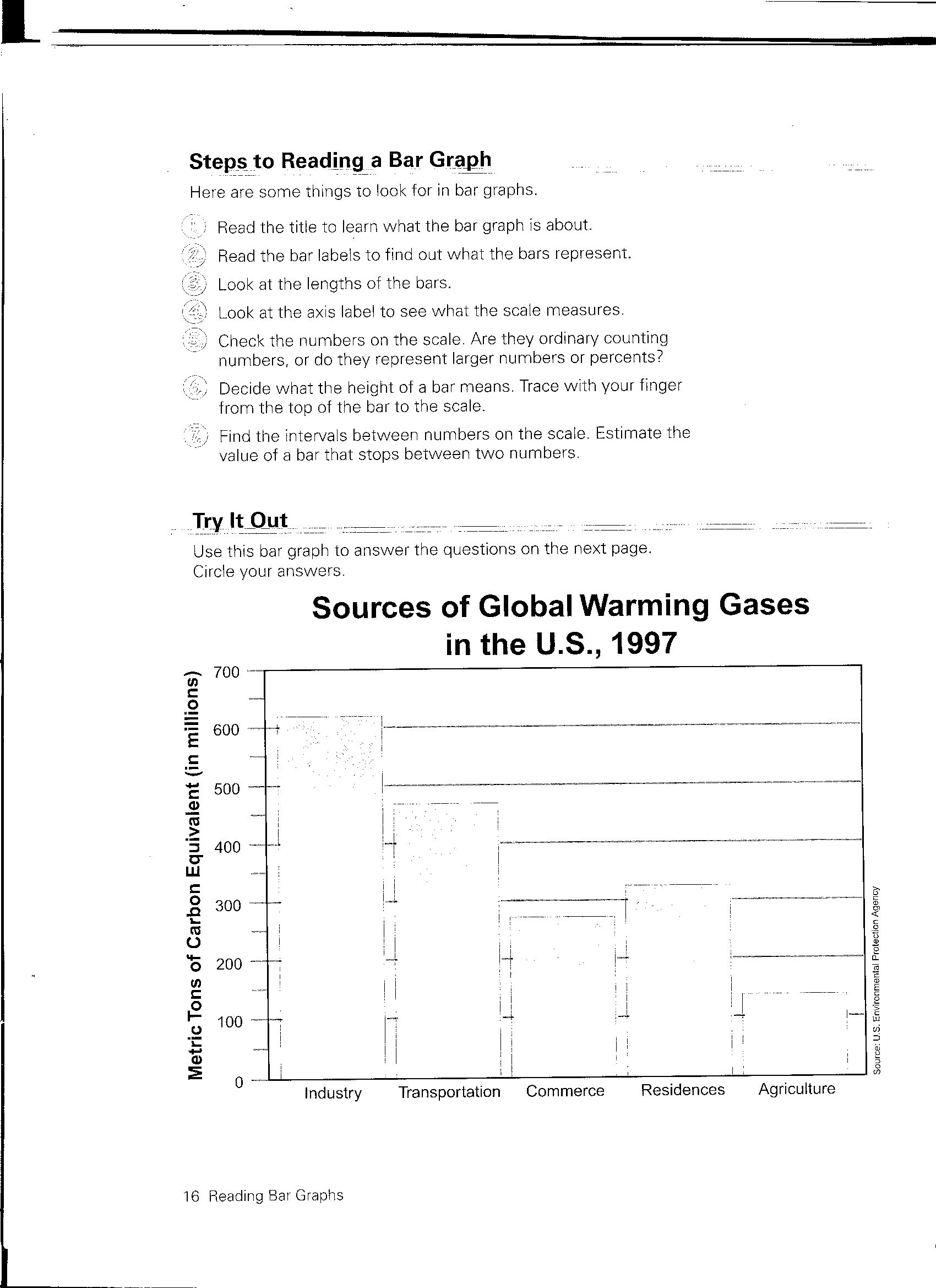
global_warming_bar_graph.jpg File Size: 576 kb File Type: jpg
Download File
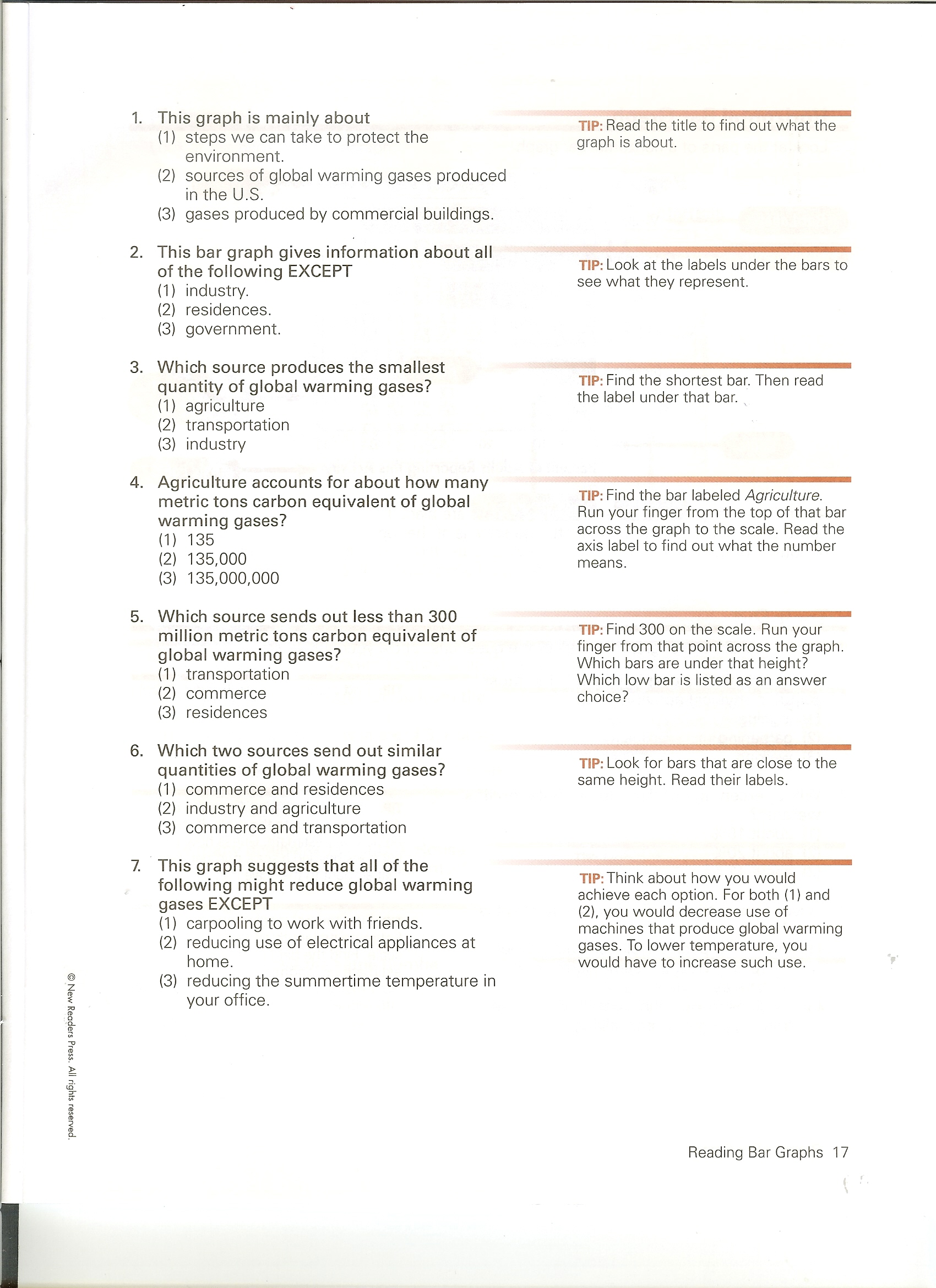
global_warming_bar_graph_pg2.jpg File Size: 833 kb File Type: jpg
Download File
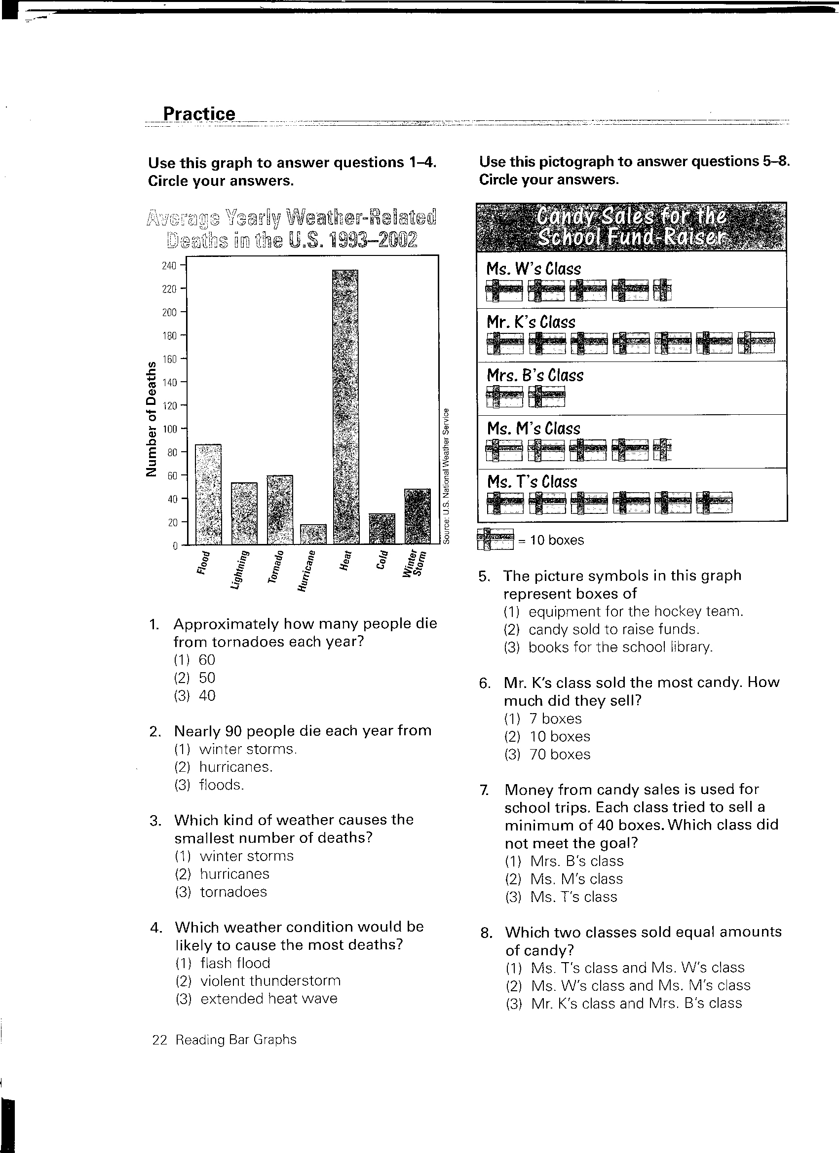
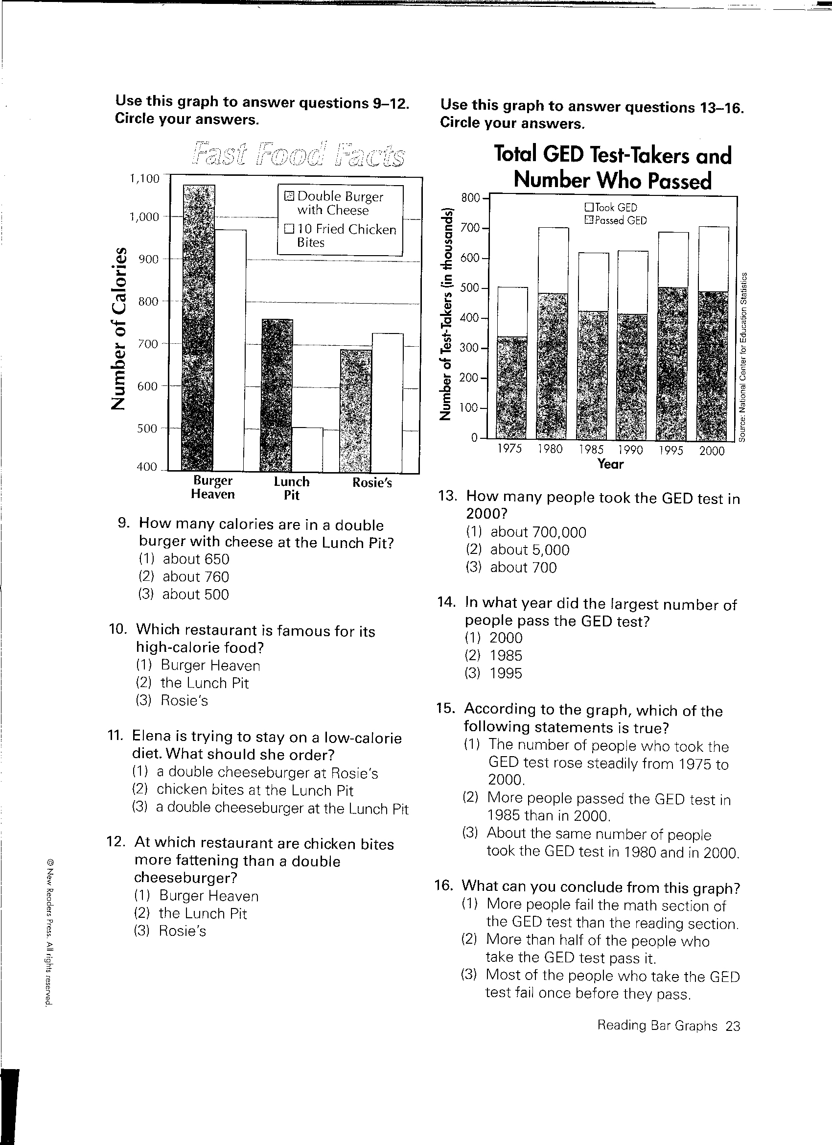
bar_graph_practice_p1.jpg File Size: 952 kb File Type: jpg
Download File
bar_graph_practice_p2.jpg File Size: 1039 kb File Type: jpg
Download File
Bar Graph Video from YouTube.com
(http://www.youtube.com/watch?v=hd3jjjrI5eI&feature=results_main&playnext=1&list=PLB8F9DD1E32F7C099)
Bar Graph Video from YouTube.com
(http://www.youtube.com/watch?v=hd3jjjrI5eI&feature=results_main&playnext=1&list=PLB8F9DD1E32F7C099)
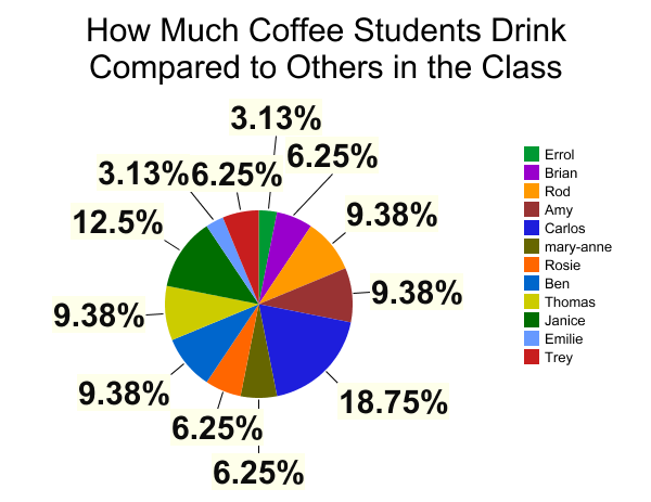
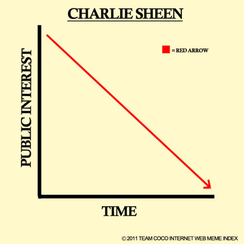
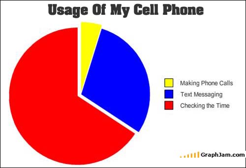
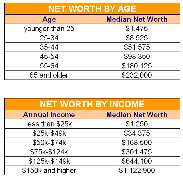
Samples of Graphs, Charts, Tables for Review:
Videos Regarding Misleading Graphs!! You can be fooled. Look closely, knowing what can deceive you. Watch these two youtube.com videos:
http://www.youtube.com/watch?v=wSCjtHt9qAU&feature=related
http://www.youtube.com/watch?v=ETbc8GIhfHo&feature=related
Go to the following website. We will read this article about why young people say the don't vote. Review the graphs and what they mean.
http://www.huffingtonpost.com/2014/10/14/young-voters-skip-voting_n_5983394.html
_____________________________________________________________________________________________________
Assignments
Assignment 1--create a graph using an online program and show/explain it to your classmates.
1.Determine what you want to show on a graph, table, or chart.
2. Determine what the variables are.
3. Determine the best kind of graphic representation you will use (bar, line, pie, etc...) to show your information.
4. Use the following site, as demonstrated in class, to make a graph, table, or chart.
http://nces.ed.gov/nceskids/createagraph/
5. Copy and save your graphic. Send it to your email or to your own thumb (jump) drive. Show it and explain it in class for a grade.
Assignment 2: Read an article from a site called "Upworthy" about the comparison of costs of having children from 1960 to 2012.
Fill in the blanks to answer questions about the two pie charts that are compared. The article, charts, and questions are in the file below.
| assignment-pie_chart_increase_costs_children.docx |
(http://www.upworthy.com/if-youre-thinking-of-having-kids-anytime-ever-this-pie-chart-might-make-you-stop-and-go-wtf)
